

Views & Navigation
Scroll-driven spatial camera framing — each section is a view.
The 'views' on this page are navigated to while you scroll.
data-foldpage-view
Scroll-Driven Camera Views
Adding data-foldpage-view to any element marks it as a camera waypoint.
As the page scroll position aligns with that element, the 3D camera smoothly repositions
and reorients to face it head-on — orienting to the element's surface normal and holding
it comfortably in frame with spring physics.
Views are collected into an ordered list. Scroll advances the camera through them sequentially. This transforms ordinary page scroll into a guided spatial journey where each section is a destination, not just a position on a vertical strip.
Numbering Views
<!-- View 0 is the home / landing position -->
<header data-foldpage-view="0">
  <h1>Home</h1>
</header>

<!-- Numbered views — framed in order as you scroll -->
<section data-foldpage-view="1">Chapter One</section>
<section data-foldpage-view="2">Chapter Two</section>

<!-- Empty value = auto-ordered by DOM position -->
<div data-foldpage-view>Auto Three</div>
<div data-foldpage-view>Auto Four</div>
Initial camera position on page load. The starting point every scroll journey returns to.
Framed in numeric order as you scroll. DOM position irrelevant — numbers determine sequence.
Inserted in DOM order among other auto views. Mix freely with numbered views.
Camera calculates viewing distance, faces the element's surface normal, springs there with elastic physics.
data-foldpage-view-link
Click-to-Frame Navigation
A view link is any element that, when clicked, flies the camera directly to frame it — on demand, without touching the scroll position. The navigation links on the home logo use this to jump between views instantly.
Two Forms
<!-- Plain: flies to frame the clicked element itself -->
<img src="photo.jpg" data-foldpage-view-link>
<article data-foldpage-view-link>Click to zoom</article>

<!-- Anchor: flies to a different element by ID -->
<a href="#about" data-foldpage-view-link="#about">Go to About</a>

<!-- If target has data-foldpage-view, triggers a scroll jump -->
<section id="about" data-foldpage-view="2">...</section>
Click to Exact Point
When a plain view link (no #id) is clicked, the camera flies to the
exact intersection point where the user clicked in 3D space — not the
element's geometric center. Clicking the top-left corner of a large image
zooms into that corner. The world moves toward your fingertip.
CSS 3D Transforms
Positioning Views in Space
Every element inside .foldpage gets a foldpage-el class
added by Fold as it processes the DOM. Your CSS can target .myclass.foldpage-el
to apply 3D transforms that are invisible to the browser's layout engine but
drive the element's position and orientation in the Three.js scene.
.view-behind.foldpage-el { transform: rotateY(180deg) translateZ(-1100px) translateY(-80px); }
The Approach: Rotate, then Translate
CSS transforms apply left to right, where each function operates in the coordinate frame established by the previous ones. The pattern used throughout this demo is: rotate first to set the facing direction, then translate to move the element to its position along the original world axes.
Transforms Used in This Demo
Panel 750px left, rotated 65° to face origin (+X direction)
Mirror: 750px right, rotated −65° to face origin (−X direction)
Flipped 180° around Y so front face points toward +Z (toward origin)
780px below and 420px forward, tilted −42° around X to face up toward origin
Overriding the Camera Orientation
By default, the camera faces a view head-on — it positions itself along the
element's surface normal and looks back at the element. You can override this
with an explicit angle using data-foldpage-view-rotation="x y z":
<!-- Camera approaches from a 30° angle on Y -->
<section
  data-foldpage-view
  data-foldpage-view-rotation="0 30 0"
>
  Side-angle view
</section>

<!-- Shift the focal point 50px right, 20px up -->
<section
  data-foldpage-view
  data-foldpage-view-origin="50 20 0"
>
  Off-center framing
</section>
A Precedent for Spatial Design
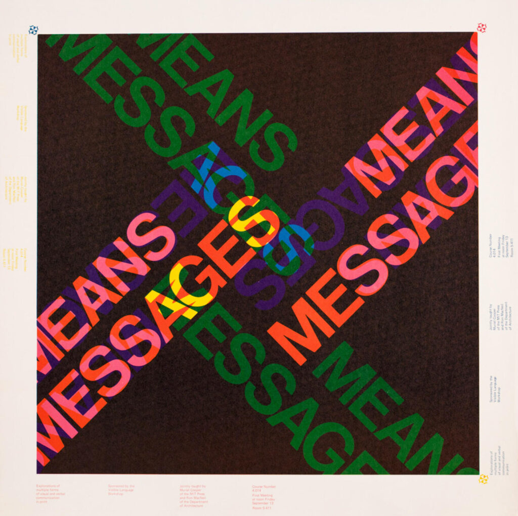
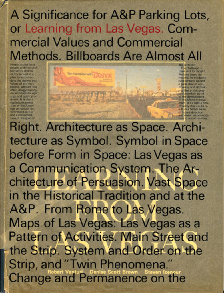
The idea that information can exist in a true multi-dimensional landscape was being researched at MIT's Visible Language Workshop in the late 1970s and 80s. Muriel Cooper and her students were asking what design principles would need to be invented from scratch for an information environment without the physical constraints of print.


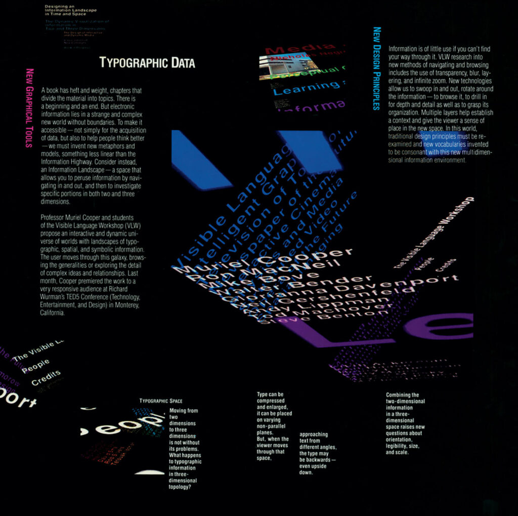
Her 1994 TED talk, delivered just a year before her death, demonstrated software that let type move freely through three dimensions — layers dissolving, zooming, rotating — with the reader navigating the information landscape rather than consuming it linearly.
"Traditional design principles must be re-examined and new visual vocabularies invented to be consonant with this multi-dimensional information environment."
Fold.page is one attempt to build on that sketch using today's WebGL, WebXR, and the familiar vocabulary of HTML and CSS that billions of pages already speak. The view system is a direct expression of that idea: your content has a position in space, and navigation is the act of moving through it.
Coordinate System
Fold maps CSS pixels to world units using a scale factor of
0.0007 units/px (pixelSizeDefault).
The default camera sits at roughly z = +0.7 world units, looking
toward the origin. In CSS pixel terms, 1000px in Z places an element about
0.7 world units away from origin — roughly one camera-distance behind
the default viewing position.
Axis directions in CSS 3D match Fold's scene:
+X = right, +Y = down (CSS convention), +Z
= toward viewer. Positive translateZ brings elements forward;
negative values push them behind.
Getting Started
Build Your Own Views
A complete views setup takes three things: the foldpage class on the
wrapper, data-foldpage-view on each waypoint, and CSS transforms on
.myclass.foldpage-el to position them in 3D.
<div class="foldpage">

  <!-- Home view at origin -->
  <header class="home" data-foldpage-view="0">
    <h1>My Page</h1>
    <nav>
      <a href="#a" data-foldpage-view-link="#a">Section A</a>
      <a href="#b" data-foldpage-view-link="#b">Section B</a>
    </nav>
  </header>

  <!-- Views positioned around the origin -->
  <section id="a" class="panel-left" data-foldpage-view="1">
    Left panel
  </section>

  <section id="b" class="panel-right" data-foldpage-view="2">
    Right panel
  </section>

</div>

<style>
  /* Left panel faces the origin (+X direction) */
  .panel-left.foldpage-el {
    transform: rotateY(65deg) translateX(-750px) translateZ(100px);
  }
  /* Right panel faces the origin (-X direction) */
  .panel-right.foldpage-el {
    transform: rotateY(-65deg) translateX(750px) translateZ(100px);
  }
</style>

<script src="fold.standalone.js"></script>
<script>
  Fold.init({ foldpage: true });
</script>
See the demos index for more features, or
read the Views & Navigation documentation
for the full reference including data-foldpage-view-rotation,
data-foldpage-view-origin, and XR auto-origin behaviour.